Summary of a Job role in film or television Job title: Film editor
The key responsibilities of this role include reviewing raw footage and selecting the best takes, as well as cutting and assembling shots.
Additionally, the film editor works closely with the director to ensure the final product aligns with the director's vision.
The film editor also ensures that sound effects, music, and transitions are implemented whilst also maintaining
the film's visual flow.
The skills + experience needed are strong technical knowledge of editing software, where that could be one of the following:
- Adobe Premiere Pro
-Avid Media Composer
-Final Cut Pro
The film editor is also required to have excellent attention to detail and storytelling ability, whilst also ensuring they have good communication and teamwork skills.
The film editor must also ensure that they have patience and creativity = and the ability to keep the same patience and creativity under pressure.
It is also ideal for a Film Editor to have previous experience editing short films, TV episodes, or student projects is valuable.
The salary ranges from £25,000 - £60,000 per year (experienced editors working on major productions can earn up to £70,000+
Real example Thelma Schoonmaker - Film editor who has collaborated with the director Martin Scorsese on many films, including The Wolf of Wall Street (2013) and The Irishman (2019).
This interests me because finding out how the Film editors work and what is needed to be in that field is very interesting, and understanding every principle that comes along with it.
This is the link for salary wages
https://nationalcareers.service.gov.uk/job-profiles/video-editor?utm_source
This is the link to the examples of the film editor
https://en.wikipedia.org/wiki/Thelma_Schoonmaker?utm_source
This is the link to the salary wages
https://www.careerpilot.org.uk/job-sectors/performing-arts/job-profile/video-editor?utm_source
-----------------------------------------------------------------------------------------------------------------------------
Film Noir
Film noir is a cinematic style and genre, primarily from the 1940s and 1950s American crime drama, characterised by its dark, pessimistic mood, cynical anti, and a distinctive visual style.
Key features include shadowy lighting, low-key cinematography and intricate, often fatalistic plots often involving crime and corruption.
The cinematography in Film noir is usually defined by low-key lighting and high contrast black and white visuals, and dramatic, often distorted angles.
Mise-en-scène relies on high contrast lighting, stark shadows, and specific settings to create a mood of mystery, danger and paranoia
The sound in film noir is characterised by its atmosphere and nature, using jazz city soundscapes and experimental musical techniques to create a sense of unease
Editing uses visual techniques and creates a sense of suspense and mystery, often employing high contrast between light and shadow and deep blacks.
Narratives in film noir are complex, often non-linear, and frequently told through a cynical first-person voice-over narration.
Characters in film noir feature archetypal characters such as the jaded private detective, the seductive and treacherous femme fatale, the corrupt cop, and the anti-hero who is often a cynical loner or a victim of circumstances.
----------------------------------------------------------------------------------------------------------------------------
Gaze
Male gaze - A feminist theory describing how visual media portrays the world from a masculine, heterosexual perspective, presenting women as objects for male pleasure
This perspective reduces women to their appearance and roles as passive objects for male viewers to identify with and control, rather than as fully-fledged characters with their own agency. The concept was first articulated by film theorist Laura Mulvey in her 1975 essay, "Visual Pleasure and Narrative Cinema," but the theory has since been applied to literature, art, and society at large.
Female gaze - A feminist theory referring to how women are portrayed and see through a
female point of view, which emphasises their agency and complexity rather than as sexual
objects. It's a response to the male gaze and aims to represent women as fully realised, autonomous subjects with their own desires and perspectives, regardless of the viewer's gender. This is achieved through different storytelling, camera work, and character development that move beyond traditional objectification.
Masculinity and femininity type
Ideally the masculinity and the man powerful man is ment to be somebody who looks muscular and has a tall frame where as nowadays its shifted towards more of a feminine approach meaning the powerful man has a slimmer frame and has feminine features and this could be a shift in audience preference and femininity is also seen as someone who is gentlest supportive and emotional yet being kid helpful and devoted yet we can also see there's a shift in this felinity making some women be portrayed more masculine then men themselves which shows how the narrative of the word masculinity and felinity has changed.
This is a visual representation of how the word masculinity has changed in the realm of the film industry.
This image shows how the representation of women's soft, feminine features can be portrayed as one of the main characters.
-----------------------------------------------------------------------------------------------------------------------------
Uses & Gratifications theory
The diversion has a huge effect in this show as there are a lot of intense moments and exciting moments, which get the audience all excited, making them hooked.
This show links to personal relationships, as in the show, the person called "Joe" has several relationships with different types of women, and shows what went wrong and what went right, and how the relationship was in general.
Many people who have had bad relationships could link themselves to the characters in this show, as in the show, there are a lot of relationships that go back, and it shows the in and out of the relationship.
The surveillance of this film shows that people may just watch the show to relate to the person he/she, which helps the audience find interest in watching it.
People use films such as "Thor" as a way to have something interesting to watch, as the film offers a lot of action, which is what the audience really likes and favours.
People's relationships & social interactions tie with this movie as Thor had problems with people socially, and people saw that as a way they could understand and empathise with it.
Many people will also tie their personal identity to Thor as he is seen as a big hero who saves the world and the day, and people resemble that with something good. That's why people put Thor pictures on their belongings to resemble him.
Many people just want to know how or what a superhero is, and the movie Thor aligns that perfectly into helping people understand a superhero and what it takes, and that somethings bad things can happen as well.
-----------------------------------------------------------------------------------------------------------------------------
-----------------------------------------------------------------------------------------------------------------------------
Analysing suspense & Tension -
Suspense and tension are closely connected techniques used to engage an audience and maintain interest in a story. Tension refers to the feeling of pressure or unease created by conflict, high stakes, or uncertainty within a scene, while suspense focuses on the anticipation of what might happen next. Writers build tension by placing characters in difficult situations where something important could be lost, and they create suspense by controlling the flow of information, often allowing the audience to know more than the characters or delaying key outcomes. Together, these elements keep readers or viewers emotionally invested, as they experience both the immediate strain of the situation and the curiosity or anxiety about how events will unfold.
-----------------------------------------------------------------------------------------------------------------------------
Understanding Media Companies
Warzone was created by Activision.
https://callofduty.fandom.com/wiki/Call_of_Duty_(series)
Activision is owned by Microsoft.
https://www.businessinsider.com/activision-blizzard#:~:text=Microsoft%20acquired%20Activision%20Blizzard%20for,Duty%20and%20World%20of%20Warcraft.
Microsoft isn't owned by a single company but has a lot of shareholders, and the largest investors and shareholders are The Vanguard Group
https://learn.microsoft.com/en-us/answers/questions/5297643/whos-owned-microsoft
Vanguard is owned by the funds managed by the company and is therefore owned by its customers
https://www.investopedia.com/articles/investing/110515/who-are-owners-vanguard-group.asp
-----------------------------------------------------------------------------------------------------------------------------
Colour Grading
In this video, I experimented with the lighting, saturation, and Input Lut, which I like as the foundation. As you can see from the image above, the difference is noticeable. I felt confident changing the lighting and felt smooth with how easy it was to navigate around the video and the lighting
-----------------------------------------------------------------------------------------------------------------------------
1. Se7en (1995) — Title Sequence
Imagery
The imagery is gritty, disturbing, and full of close-ups: hands cutting out words from books, journals, razor blades, needles, and handwritten notes. It looks like a serial killer’s scrapbook.
Animation/Movement
Fast cuts, jittery camera movements, double exposures, and flickering frames. The movement is chaotic and disorienting—nothing is smooth.
Text
The titles appear scratched, hand-written, or glitched. They jump, flicker, and shift slightly out of place, reinforcing the uneasy tone.
Colour
The colour palette is dark and desaturated: blacks, greys, dirty yellows. It feels grimy and polluted.
Pace
Very fast-paced editing—rapid cuts and overlapping visuals give it a panicked, obsessive feel.
Sound
Industrial, mechanical sounds mixed with tense music. Lots of metallic noises, scratches, and static—almost like you’re hearing inside a broken machine.
Atmosphere
Unsettling, tense, disturbing. It sets the tone for a dark psychological thriller before the film even begins.
My opinion Opinion
In my opinion, this is one of the best title sequences ever made. It perfectly captures the killer’s mindset and builds dread immediately. It feels like you’re inside the mind of madness.
2. Stranger Things (2016– ) — Opening Titles
Imagery
The titles are minimalistic. Letters slowly come together to form the glowing red STRANGER THINGS logo. There are no characters—just typography and light.
Animation/Movement
Letters slide smoothly across the screen, spacing out and then locking into place. The movement is calm and controlled.
Text
Retro, 1980s-style font inspired by Stephen King book covers. Clean lines, glowing edges, and slow formation.
Colour
Black background with strong neon red lighting. Blue accents. Very bold and iconic.
Pace
Slow and atmospheric. The sequence takes its time, letting the tension build.
Sound
Synth-heavy, 80s-style music. The soundtrack pulses and builds, creating suspense and nostalgia at the same time.
Atmosphere
Mysterious, nostalgic. Doesn’t show anything scary, but the mood suggests something supernatural.
My opinion
I like this title sequence because it’s simple but instantly memorable. The music, combined with the glowing red text, creates a vibe that’s both retro and suspenseful. It pulls you right into the world.
-----------------------------------------------------------------------------------------------------------------------------------------------------------------------
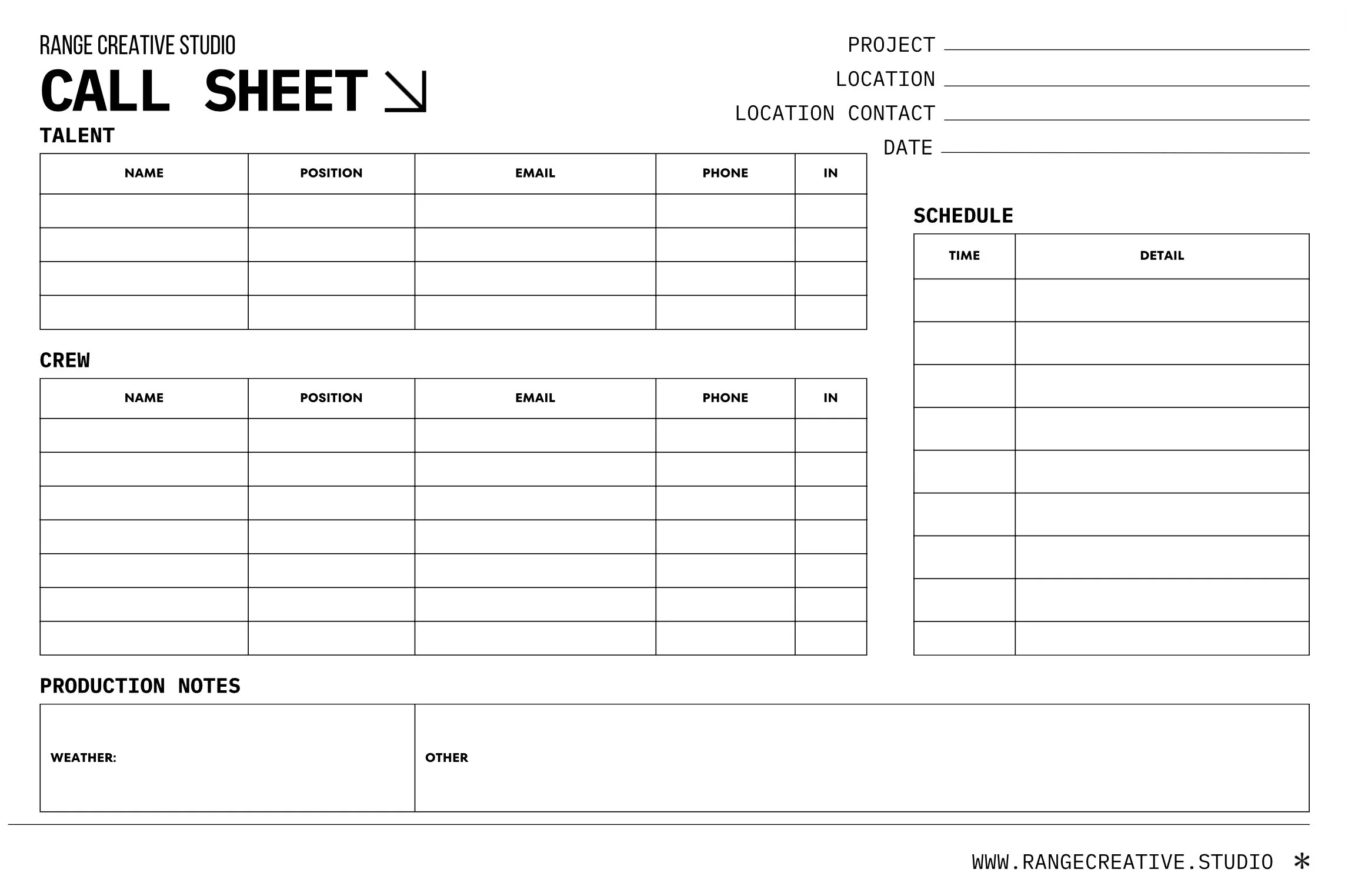
Organising a massive team of people with a massive apartment, but with this call sheet, it's easy for people to understand what they need to do and what their allocated time is when they are in need of a break or lunch to stop chaos, etc.
-----------------------------------------------------------------------------------------------------------------------------
Suspense In Films
Movies that operate on suspense give the audience a more objective perspective. Sometimes, this objective perspective allows the audience to know more information than the characters do. This is otherwise known as dramatic irony. The result is anticipation as we wait for the character to learn the truth.
https://www.youtube.com/watch?v=hMgCg6SaS6U
In this video, we can see how suspense is shown as the tractor pushes the car forward and appears out of nowhere, and he approaches the train, he comes to a stop, yet the tractor is pushing him, putting the audience in a position to feel suspense as this is an [erfect example of how suspense is laid out in films.
-----------------------------------------------------------------------------------------------------------------------------
Press Kit
A press kit is a collection of promotional materials provided to the media to give journalists essential information about an individual company or event.
A press kit is usually for a collection of promotional materials, images and information about a person or company that is distributed to the media to help them cover a story. It serves as a one-stop shop for journalists, providing them with all the necessary facts, figures and assistance to write about a company's announcement, product launch, or other news.
A press kit might contain a curated selection of information and assistance designed to provide journalists, media outlets, and potential partners with everything they need to write a story or learn about your company, product, or event.
-----------------------------------------------------------------------------------------------------------------------------
Planning with my group - Strengths and weaknesses
When I was planning with my group we discussed who was going to be acting and filming and other stuff within the group, whilst this is kept in mind we discovered the strong attributes and attributes not as strong for me the strong one was planning and fr others in my group is acting and following through which works well in the end as each of us have different types of strength and weakness which is why the group will work well.
In my group, we decided to use the scenario of
-----------------------------------------------------------------------------------------------------------------------------
Narratives and loglines
The difference I saw in the before and after was very interesting and something that is worth remembering, as it is a very useful feature. One thing that stood out the most was the Input Lut and how beneficial and sufficient it was, and it worked like a foundation of something which is useful.
A log line is a one-sentence summary of a story, film, or television. It includes the main character, the inciting incident, the central conflict and the goal.
Down below is my scenario!
-----------------------------------------------------------------------------------------------------------------------------
In the Design tutorial following
The picture above shows the first section of the tutorial when I created the man and the oval-shaped object in the background and added a fade in the background. Whilst doing this, I also decided to blend it in with the text, which I believe fits well.
This was the second part of the tutorial, when I created the 3 circles, which are called the "Ellipse frame tool" and added a proportional image of a wolf in the three circles and also added a text saying "The strange man" with a custom fade added to it, similar to the first section.
Here, I added a fade-in effect for the man. I think it fits the scene well and works nicely with the title "The Strange Man". The way he slowly appears adds a sense of mystery and makes the introduction more interesting.
I then added some text to give the video an extra effect and make it more engaging. Overall, I think it came out really well and helped improve the final look of the project.
For the last page, I used alternating images and text, with "The Strange Man" written in the centre. I think this helped bring the project together and gave the ending a clean, finished look.


No comments:
Post a Comment